10 Exterior Accent Colors That Pair Beautifully With Red Brick
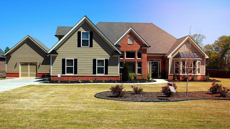
There's no denying the classic beauty of red brick. Since 7000 BC, brick has been used to construct homes that are as attractive as they are sturdy and functional. Modern brick homes often include wood paneling and accents like shutters, window trims, and doors — and those exterior accents are typically painted in a shade to complement the rich red brick. Vivid blue-greens and icy whites pop while darker shades create a timeless appearance. There are many possible color combinations, but some are far more impressive than others. So, we're sharing our favorite exterior accent colors that look beautiful against red brick.
We've looked at some of the most popular exterior paints on the market and selected 10 shades that are complementary, analogous, or contrasting. Some of these hues are vivid and loaded with pigment, while others are more subtle and HOA-friendly. No matter your preference, each of these exterior colors is sure to make your home look more inviting and maybe even worthy of a front-page spread in Architectural Digest.
1. Benjamin Moore Aspen Skies
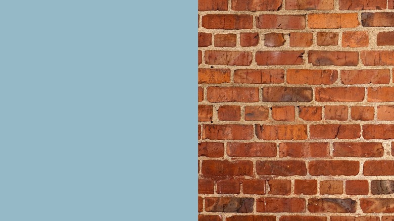
Colors in the blue-green family and red are complementary and thus always look stunning together. Aspen Skies is a more muted, blue-leaning tone. When paired with red brick, it will highlight the accented areas and create a soft but eye-catching contrast. This color is perfect if you want to differentiate spaces but keep your tones slightly muted.
2. Valspar Classic Khaki
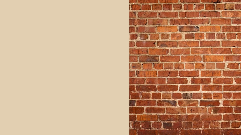
Classic khaki is for the homeowner who wants a juxtaposition of color but would prefer a neutral tone to something more vibrant. Valspar's Classic Khaki is a warm, yellow-leaning beige that brings attention to the exterior accents without detracting from the darker red. This shade is perfect for homeowners who want to highlight the brick first and the accents second.
3. Sherwin-Williams Shell White
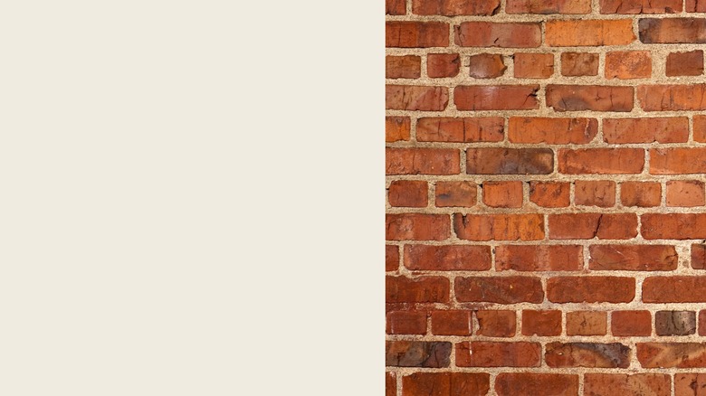
One may not consider white a bold accent color, but when you pair an icy white with a rich red, it's striking. Sherwin-Williams' Pure White is a brilliant neutral that creates a dramatic contrast yet doesn't pull focus away from rustic brick tones. It's crisp and bold but could still improve the overall value of your home. Additionally, Pure White is more likely to be accepted by HOAs, which typically reject vivid colors.
4. BEHR Cricket Field
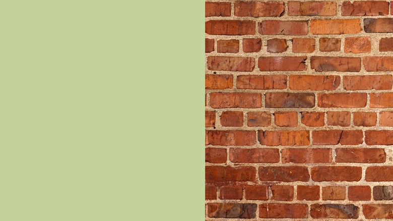
BEHR's Cricket Field is a slightly muted grassy tone that looks stunning alongside a deep red shade. It's perfect for highlighting doors, trim, and accent paneling. Red and green are bold opposites, and while that may sound like a tense color combination, this particular shade of green has enough yellow to pair nicely with an earthy brick red.
5. Benjamin Moore Bordéaux Red
Benjamin Moore's Bordéaux Red is a wine-inspired shade. While purple is a cool color, it's made with red and, therefore, analogous on the color wheel. This means that they are similar but not the same. Bordéaux Red is a bit removed from brick red, but it's close enough to share a color story and look absolutely beautiful.
6. Valspar Blue Nebula
If you really want an exciting exterior and won't back down from a vivid color, consider the awe-inspiring Nebula Blue from Valspar. Nebula Blue is the perfect opposite or complementary color to brick red. You can find this combination in art, fashion, and interior design because the colors, while drastically different, create an attractive harmony that allows both shades to shine.
7. Sherwin-Williams Lounge Green
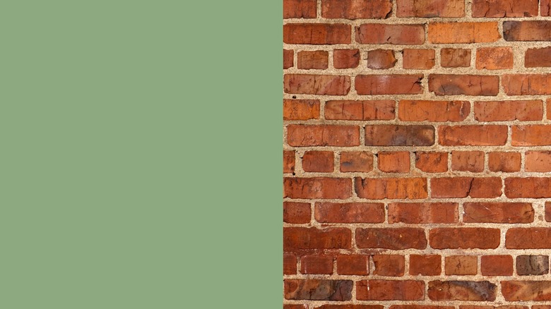
Richer and darker than Cricket Field, Sherwin-Williams' Lounge Green is more subtle yet still eye-catching when paired with red brick. It's a great choice for trim and smaller accents but may clash when used on large paneling. For example, a Lounge Green door in the middle of a brick facade will pull focus in the best way.
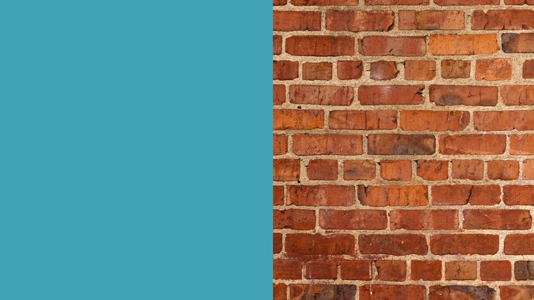
8. BEHR Underwater
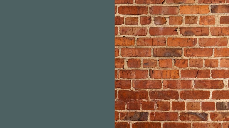
BEHR's Underwater shade is a stormy sea blue that leans gray. It's colorful without being too vibrant and still acts as a complementary tone against deep red. It has a neutral quality that's subtle enough for side panel walls as well as accents. Underwater is a great choice for those who want more pigment but are wary of brighter exteriors.
9. BEHR Honey Tea
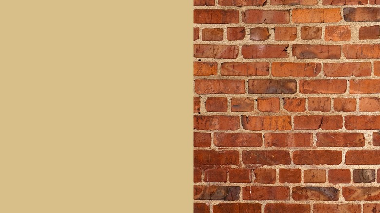
There's nothing wrong with pairing brick with an old neutral standby. BEHR's Honey Tea is a yellow-leaning beige shade that's darker than Valspar's Classic Khaki, yet it's light enough to create an attractive contrast of tones. Like rustic brick red, it too has an earthy quality almost like a sand color. It's gentle enough to go on accent walls and will also pop as a trim or door color.
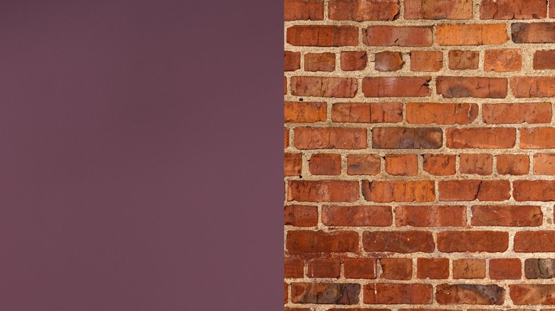
10. Farrow & Ball London Clay
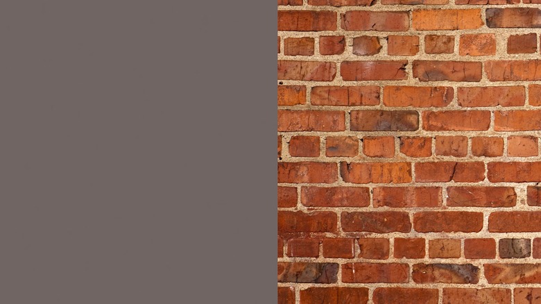
Black can be a difficult exterior shade to blend. While it provides excellent contrast, it may seem too harsh for larger accent paneling or doors. Farrow & Ball's London Clay is a purple-leaning dark brown that will give you the same gorgeous juxtaposition of color without looking flat. The shade is made with a magenta pigment so it will pull out the crimson and maroon hues of adjacent bricks.