6 Of The Biggest Design Mistakes We've Seen The Property Brothers Make

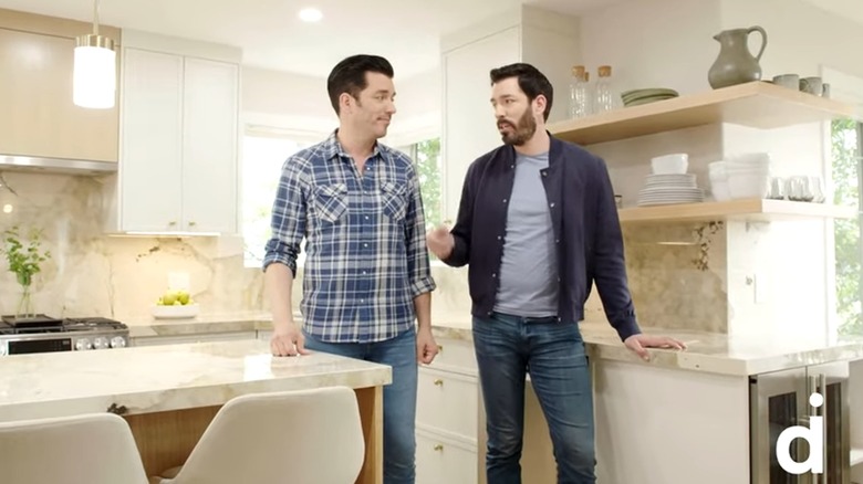
Twin brothers Drew and Jonathon Scott have taken HGTV and the world by storm since their first series — "The Property Brothers" — premiered in 2011. Since then, the duo has starred in at least another seven home-renovation-based shows, including Property Brothers Forever Home, Celebrity IOU, and Brother vs. Brother. With so many episodes of so many shows afoot, the brothers are bound to have made some design mistakes along the way — and we're not just talking about the allegedly shoddy work that led to them being associated with a lawsuit against HGTV's production company, Cineflix, in 2021 (via ABC 13).
From missed opportunities for functional storage solutions to features that just don't make sense for the homeowners who actually live in the house, we've tracked down the biggest design mistakes made by Jonathon and Drew Scott across their television programming dynasty. If you've ever longed to live in a home renovated by "Property Brothers", you may feel better about your circumstances after viewing these questionable design choices.
Placing furniture in front of windows
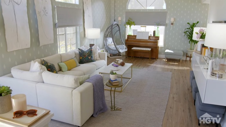
If there is one design sin that Drew and Jonathon Scott are guilty of committing again and again, it's placing furniture in front of windows. One of many examples of this phenomenon takes place in episode 6, season 4 of "Property Brothers Forever Home." The homeowners — who are renovating their home to adjust for their daughter's transformation into a teenager — are provided with a newly redesigned living room that features two gorgeous oversized windows. Unfortunately, the brothers have placed a sofa in front of one and a piano in front of the other.
According to Healthline, living in a home with abundant sunlight and views of a natural outdoor setting can offer a plethora of health benefits, including a reduced risk of seasonal depression. Avoiding this mistake would have been simple; smaller seating solutions (instead of a sectional sofa) could have been used to better fit the space around the widows and the piano could have been moved to the partial wall. Instead, the natural flow of light and energy throughout the space is disrupted.
White dining chairs in a home with children
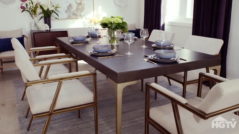
In addition to blocking windows with furniture, Jonathon and Drew Scott appear to love covering homes in the color white. It is not at all uncommon for a "Property Brothers" renovation to feature white paint, white countertops, white cabinets, white rugs, and white furniture — sometimes all in the same room. One move that feels both unforgiving and unforgivable is their penchant for placing pure white dining chairs in the homes of parents with young children. One such scenario unfolded on episode 13, season 1 of "Property Brothers Forever Home."
It is revealed during the episode that the homeowners purchased the house while believing that they would be unable to have children. In a much unexpected turn of events, the couple went on to have two kids, prompting them to request a renovation to better accommodate their new family lifestyle. Drew and Jonathon congratulate them on their young children by setting them up with a dining area filled with stark white upholstered chairs. Anyone who is a parent or has met a toddler knows that these chairs will be covered in fingerprints and food stains by the end of the family's first meal. Perhaps instead of leaving the homeowners with a future full of expensive cleaning bills, the brothers could have chosen dining chairs made out of a wipeable material like leather or a set that was fit with washable slip covers.
Forgetting to add entryway storage
We can't blame designers like Drew and Jonathon Scott for wanting the homes they renovate to look beautiful. However, for a homeowner to actually live comfortably within a house, function needs to be prioritized as well. An excellent example of one of the brothers prioritizing aesthetic over function occurs in episode 1, season 7 of "Brother vs. Brother." While competing in a living room renovation challenge, Drew creates an entryway that offers zero solutions for storing shoes or jackets. While this route might better enable the house to appear sleek and sophisticated, in reality, it greatly increases the chance that guests and residents alike will be walking across the house in dirty shoes to find somewhere to put their footwear away.
Every entryway into your home should feature — at the very least — a mat or rack for shoes and a rack or hooks for coats. If the door in question is only used by guests, keeping it minimal is fine. Offering no solution at all, however, is clearly a mistake — especially on a show that is centered around selling the home for a profit after the renovation. If a mud room adds value to a home, then surely a mud nook is better than nothing.
Mixing clashing patterns and colors
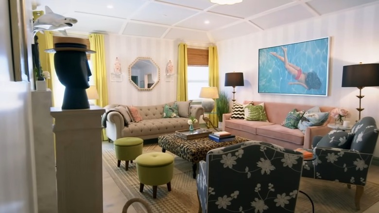
Based on our research, it's safe to say that most of the homes featured on the Scotts' shows end up with a very neutral (typically white or cream-based) color palette. This pattern was broken by Drew Scott in another living room flip challenge featured in episode 2, season 8 of "Brother vs Brother." For reasons that remain unknown, the designer chose to stray from the brothers' typical safe neutrals and loaded with room with furniture and curtains that directly clashed with each other.
While we're all for the brothers stepping out into the world of bolder colors, combining solid chartreuse, leopard print, pink, and black-and-white florals felt like a pretty significant mistake — particularly in a home being resold. When staging a home for sale, it is generally recommended to stick to neutral colors with small pops of bolder hues. This allows potential buyers to imagine their own style in the space while still feeling wowed.
Choosing cream countertops as a bold statement
Bold colors might not be the best choice when staging a home that you're attempting to sell, but when a current homeowner requests boldness in the house they already own, their designer should deliver. This is exactly what did not happen when the homeowners featured in episode 12, season 6 of "Property Brothers Forever Home." The owners of the home communicated a love for wild animal prints and bold features. What did the Scotts deliver? A neutral, cream-based countertop. Worse yet, they described the bland counters as a more "tasteful" way to incorporate the requested "boldness" (via YouTube).
The renovations featured on HGTV shows are far from inexpensive. When a homeowner is investing a large sum of money into renovating their home, ignoring their preferences is a clear mistake. If the brothers were set on the neutral countertops, they could have incorporated a bright, bold backsplash or another eye-catching kitchen feature instead of leaving a quirky couple with a generic redesign.
Removing a bathroom in favor of less valuable space
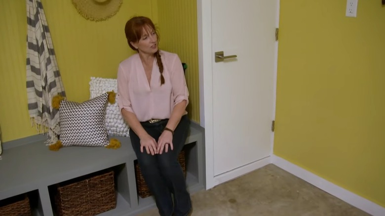
In episode 4, season 5 of "Brother vs Brother", Jonathon and Drew Scott compete to create the superior indoor/outdoor lounge to accompany coastal homes. Jonathon's home featured a large unfinished bathroom in the lounge space. Rather than taking the opportunity to add value to the home by finishing the bathroom — even if that meant making it smaller — the brother chose to remove it completely. This doesn't only seem like a mistake regarding property value; it also makes no sense in a lounge meant to serve as a space to hang out when the homeowners and their guests return from boating or swimming. In its place was left a simple bench and a basket for shoes.
When it comes to the errant nature of removing a bathroom in favor of less valuable space, don't take our word for it. "Consider renovation over removal if the bathroom is poorly functioning," Jennifer Turano — a licensed real estate salesperson at Compass in Connecticut — told Apartment Therapy, "as it's usually less costly and less intrusive." She continued, adding that "it is generally cheaper and smarter to use the same money you would spend to demolish a bathroom on creating a quick makeover and fix."