Get A Home Town-Inspired Look With Erin Napier's Top Painting Tips

We may receive a commission on purchases made from links.
Paint is one of the most cost-effective ways you can revamp a room –- or even a whole house. For under a hundred bucks, you can cover up imperfections, marks, and stains, and wash your space with a new hue and a fresh feel. Not only is paint cheap, but it's a relatively simple update that is definitely DIY-able. However, there are some complexities to even this seemingly straightforward fix.
Ben and Erin Napier are no strangers to the power of paint and are masters at using it to make old houses new again. They have made a business out of taking old homes and transforming them into updated abodes that are full of easy charm. In an interview with Business Insider, Erin Napier said, "Paint changes the world." Over the years, the Napiers have learned a couple of lessons when it comes to painting and have also dropped some hot tips.
Not only is Erin Napier a seasoned decorator by this stage, but she also began her career with a degree in fine arts, which firmly qualifies her in color theory. If you want to learn some secrets about picking the perfect shade for your space, and which things you probably shouldn't paint, you've come to the right place. Read on for a roundup of Ben and Erin Napier's best painting tips that are sure to get you that Home Town-inspired look.
Never skip swatching
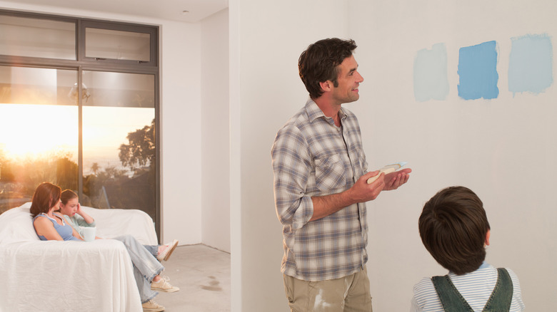
Have you already got your eye on a paint color that you feel will be perfect for your home? Or maybe you still have to decide on a shade. Either way, you should follow the golden rule and always swatch the color first, even if you've used it before in a different space. In an Instagram post, Erin Napier shares, "Paint tip: if you're painting an exterior, never skip swatching!" Once paint is up on the wall, it can look very different from the color on the can. Everything from the aspect of the room to the tone of your floors can alter how the shade reads in your space.
Not only should you bring color chips back from the paint store, but you should also pick up a few paint samples in varying shades. Brush these onto a section of the wall so you can compare them. Keep in mind that the existing wall color can influence how the swatches look. Light colors will make swatches appear darker, warm tones can accentuate cool shades, and vice versa. To counteract this, make sure you paint a generous-sized test square. Trying to determine the color for an entire room from a post-it-sized patch is the most common paint swatch mistake. You'll also want to paint a second coat over your swatches. A single coat can skew lighter and less saturated, which could throw off your selection.
Always factor in the lighting
Lighting can dramatically affect how a paint color looks. This is another reason why you should always swatch, both for interior and exterior painting. If you're painting the outside of your home, you'll want to see how the natural light interacts with the color. In her Instagrampost, Erin Napier said, "What looks good in artificial light will look MUCH different in the sun." The same principle holds true indoors. A wall that receives direct sunlight won't show up in the same shade as one that just gets diffused light.
To avoid any surprises, plan for this when you swatch. Think about the different lighting your home receives and paint test patches in various spots. If you have a room with some dark corners, as well as swatching in the middle of a wall, you may want to paint a square in an area that receives dim light to see how your paint color performs there. Besides evaluating how potential paint shades look in natural light, you'll also want to turn on your overhead lights and any accent lights to see how they interplay with the colors you've picked at night.
Still busy decorating? If you're painting indoors, you might want to get your lighting plan figured out beforehand. When you paint your swatches, you'll then be able to view them under the bulbs and lamps that are going to be in the space long-term. You can also take this opportunity to pick a light bulb that will make any paint color shine.
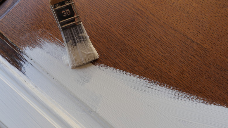
Don't paint your baseboards
Painting trim and baseboards is one way to bring a home out of the past and give it a trendy look. But this might not always be what you want, especially if you're taking inspiration from "Home Town." If there's one thing Erin Napier wouldn't paint during a renovation, that's trim. During Season 7, Episode 3 of "Home Town" (via House Beautiful), the HGTV star observed, "Most people want to paint their historic trim. I think it's a huge mistake 90 percent of the time." Ben Napier backed her up, warning, "Once you paint it, you can't go back!"
Keeping original trim and wood paneling can help you pay homage to your home's past and preserve its original character. Unpainted trim can also add depth and contrast to a space through the natural wood tone and grain. Old growth wood is irreplaceable and adds a unique element, something that pots of paint can't do.
However, there are some situations where painting original wood could be the most practical option. If your trim work is in rough shape, repairing the damage (rather than replacing it) and then painting could save you money and reduce waste. Or maybe the trim in your home isn't stain-grade? Taking a brush to paint-grade pine is not a sin, as that's the finish it was manufactured for. Practical considerations aside, personal tastes are also important. Interior decorating fads come and go, and you definitely shouldn't paint over historic trim just because all-white interiors are in. But if white trim is truly in line with your long-term style (and you plan to stay in your home), covering the original wood might not be a mistake.
Opt for yellow undertones if you want an aged look
You don't have to watch too many episodes of "Home Town" to see that Erin Napier's paint color selection is on point. Time after time, the HGTV host has knocked it out of the park, selecting shades that seamlessly blend with the home, enhance its atmosphere, and freshen things up without ever feeling out of place. It turns out, the designer has a secret formula, which she shared in a blog post on her website, Laurel Mercantel, saying, "The key to choosing colors that feel part of their surroundings, that feel aged ... is.. Dinge." By dinge, she means yellow undertones, explaining, "Choose whatever color you like that has a bit of yellow in it to make the color feel integrated and truly part of its environment instead of too-new, too bright, not quite right, and out of place. It is so subtle, but an important delineation between a house that's comfortable in its color versus a house that's squeaky."
Not sure which hues hit this mark? For folks who don't want to spend hours analyzing undertones, Napier goes on to share some recs, including her favorite white paint color, Dover White by Sherwin-Williams. The HGTV host describes this as "the color I've painted almost every room in my own home." She also says it's the one her "design team just defaults to when they aren't able to get a quick decision from me in a pinch." If you're looking for the perfect moody tone, she recommends Rock Bottom by Sherwin-Williams.
When in doubt, go for a dusty shade of pink
Pink paint shades have long been an interior favorite. Pink was bang on trend in Victorian times and continued to spike in popularity through the decades. In the last couple of years, millennial pink had its moment, and now brighter tints are gaining popularity as people participate in the Barbiecore trend. But if you want to channel a traditional, transitional, or hometown-esque feel, then dusty shades are the way to go. Not only do dusty pinks feel more in keeping with historical homes, but they also age well. Once again, Erin Napier advises homeowners to look for shades that have a hint of yellow. In an Instagram post, the designer shared, "If you're going to paint with pink, choose a dusty one with a yellow undertone... like Cape Sands by @valsparpaint. It reads as a neutral in natural light, never babyish or bubblegummy." So if you're swooning over pink kitchen ideas, this could be the perfect subtle paint shade for your cabinets.
If you're after something a little moodier, you can also consider deep, dusty, bruised pinks, which show signs of becoming a 2024 trend. Earthy shades like Sulking Room Pink by Farrow & Ball are a great option, as they feel both subtle and grown up. Or, opt for proper peach tones for an Erin-Napier-approved look. During an episode of Erin'spired on YouTube, she shared, "To me, the only good pink in the world leans a little bit peach. Think of a vintage nightgown from the 1920s."
Bright, light colors can make for a happy home
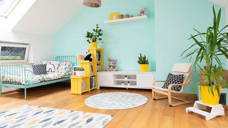
Money might not buy true happiness, but the right paint shade could bring some extra cheer, according to Erin Napier. During Season 5, Episode 2 of "Home Town" (via Southern Living), she shared, "I did a lot of research in college about color psychology, and certain colors make you feel hungry or happy or sad or sleepy." This knowledge shows in her designs, as Erin Napier's color game is on point. Her secret to a happy home? Soft, light-hearted shades. "In a color palette of sky blue, light-coral colors, lemon-meringue yellow, and then lots of neutrals and creams around those colors, together give you a feeling of happiness."
Besides being uplifting, light color schemes like this are also relatively easy to implement, especially if you're starting with a neutral base. Off-white walls are the ideal backdrop against which airy yellows, blues, and pinks can pop. But if you want to make a statement, feel free to paint out your place in something other than white, or channel these shades through wallpaper. Got dark wood trim or furniture and are worried it will clash? Deep wood can work well with pastel hues, especially in a historic home. Light yellow, pale coral shades, and blue are very classic colors and won't feel out of place next to traditional wood tones, especially in Federal-style homes.
Paint is the cheapest way to update old cabinets
If you're renovating an old kitchen, you may assume that step one should be to rip out the cruddy old cabinetry. But this could inflate the price of your renovation by a few thousand dollars, as new kitchen cabinets can cost anywhere from $2,000 to over $20,000. Fortunately, there is a cheaper route. By this point, Ben Napier has had extensive experience with updating old kitchens, and according to him (via Business Insider), "A lot of times the cabinets are fine, and they just need to be painted."
Painting your kitchen cabinets is a relatively cheap and simple upgrade that can seriously change the aesthetic of your space. If you want to do the job yourself, start by assessing whether the existing paint is acrylic or oil-based. If the cabinets haven't been touched for decades and they have (or had) a glossy finish, then you're probably dealing with oil-based. If you want to paint over with acrylic, you will need to sand the finish and apply a coat of bonding primer. If you need to make any repairs, like filling in holes from hardware, prime these areas as well. For an ultra-smooth finish, use a foam roller or look into getting a paint sprayer. Providing you use them properly, paint sprayers can give a super seamless finish to cabinet doors, and you can pick one up with good reviews from Amazon for well under a hundred bucks. Alternatively, the cheapest paint sprayer at Home Depot retails for around $70. If you decide to spray instead of roll, practice on some scrap wood first to get the hang of it.
Neutral walls will make bold accents pop
Erin Napier's design choices are anything but bland. However, the HGTV star typically sticks to relatively plain paint colors. On her website, Laurel Mercantile, Napier writes, "People often compliment my use of bold color in homes, but in actuality — I keep it surprisingly neutral on the walls and sometimes introduce an unexpected bold color on the trim, or just in the furnishings we bring into the room."
The takeaway? You don't have to commit to a gutsy wall color to make a statement. Paint colors that fade into the background are often easier on the eye and simpler to decorate around. White or cream walls are amazing for displaying artwork, and a couple of bright accent colors are often all you need to inject pizzazz into a neutral space. If you love patterns and prints, a pale backdrop can help make "busy" furniture and textiles feel curated and eye-catching.
If you do want some color on your walls, but still want to keep the energy soothing and peaceful, opt for a super soft, airy hue. Want an Erin-approved pick? Celery Salt by Benjamin Moore, a dreamy off-white infused with warm green undertones, is another of her personal favorites. Speaking of undertones, make sure you take them into account, no matter how light your paint color. The right undertones can help you tie in your furniture, flooring, and finishes.
You can give new bricks an aged look with spray paint
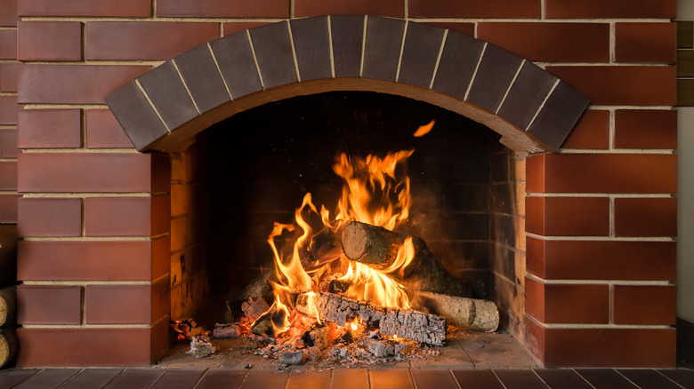
Are you building something in brick and want it to match an older area? No problem; the Napiers have a smart hack. In a set of web-exclusive tips published by HGTV, Erin shares how to make new bricks look old as they get ready to modify an existing fireplace, saying, "The problem is, the chimney has soot from a million years of use. These bricks are going to stick out like a sore thumb if they don't look a little sooty. We'll just dust the edges of them with this," says Erin Napier, holding up a spray can, "so they look like they've always been there."
If you're trying to make a match with sooty bricks, a charcoal spray paint color is going to be your best bet. Just spray the edges lightly and try to mimic the amount of staining the original bricks have. Ideally, you should doctor your bricks before they get mortared into place. If you mess up one, you can just discard it. If you're laying the bricks yourself, you can also use a DIY technique to make the mortar look old by removing the excess with a brush rather than using a line or your finger.
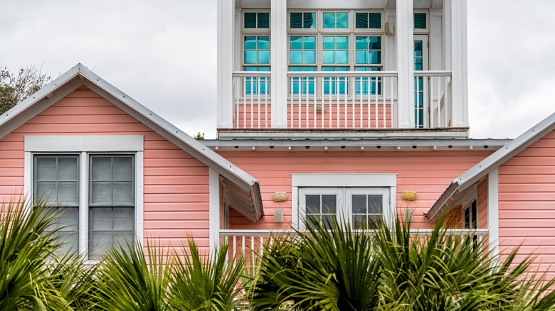
You might want to hold off on painting your home's exterior
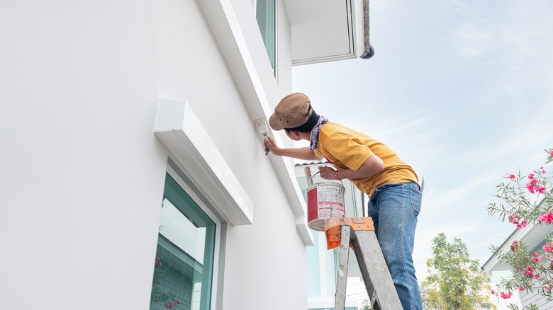
Painting the exterior of a home can put a fresh stamp on a property and really make it feel like your own. But there are times when it may be wisest to resist. One of these is if the original color was professionally picked out. During Season 8, Episode 2 of "Home Town", Ben and Erin Napier were faced with the task of putting a modern twist on a traditional house. The owner wasn't a fan of the exterior color, a muted sage (which is Erin Napier's favorite exterior paint shade). But the paint was in great condition, and the Napiers convinced him to stick with it, saying (via Realtor), "When you have fresh, beautiful, designer-chosen paint on the exterior of a house, you keep that paint if you can." By opting not to repaint, they were able to devote more budget to the interior and have enough wiggle room for features like a sunken outdoor hot tub on the back deck.
So even if you're not totally in love with the color of your home, postponing painting could pay off. The majority of houses with wood, aluminum, or stucco siding require a fresh coat of exterior paint roughly every three to seven years. So unless your home has a brick exterior, the opportunity to paint it a different color will roll around sooner rather than later. In the meantime, smaller updates can do a lot to change up the look. You can repaint your front door or window trim a new color, do some landscaping, or even stain your exterior metal fixtures with this DIY TikTok swears by.
Green can make for a great neutral
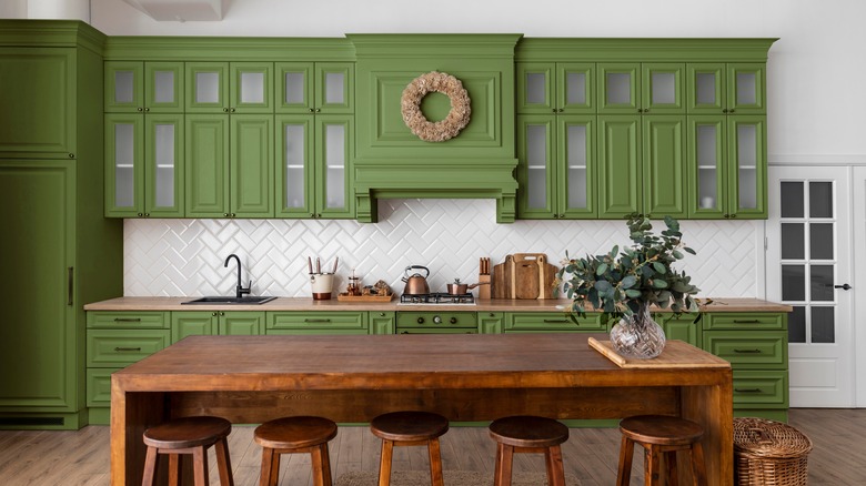
If you're a fan of the show, you'll know that Erin Napier loves a soft green. In fact, she's fast making green the new neutral, saying on her website, Laurel Mercantile, "You may think green is not neutral, but I say it certainly is. Look out your window and tell me what naturally occurring color you see the most of!" Muted shades of green can help tie your home into the existing landscape, both from the outside and within. For instance, pale green wall paint in a room with a big window looking out into a verdant garden can help to bring the outside in and create a flowing palette.
If you want a soft green that's calming, shades of sage have been trending for some time, but it's also a classic color that many designers consider timeless. It complements a huge range of other hues, including soft pinks, blues, gray, red, black, brown, and almost any shade of white or cream.
Want to go a little bolder? Dark greens are having a huge moment in interior design right now, with forest greens leading the pack. These deep shades are ideal for moody spaces where you want to add a little drama. Erin Napier doesn't often turn to very dark paint colors, but when it comes to green, deep tones can tie in well with traditional and historic homes.
The Napiers aren't sure about painting tile
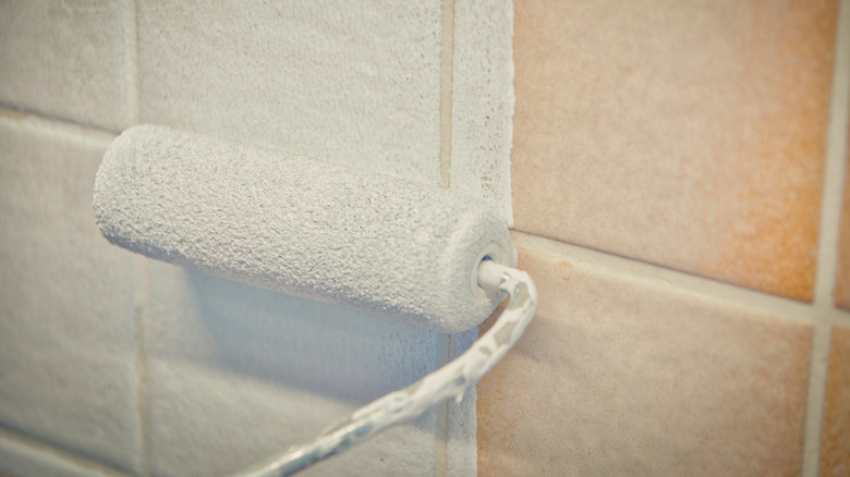
Painting over tile is one way to DIY a bathroom refresh without having to demo anything. However, the Napiers are a little wary about this hack. Ben Napier revealed he's not sure about the longevity, saying (via Real Simple), "I don't know how it would adhere to a porcelain tile." Erin Napier concurred, saying, "I could change my mind later, but right now, I'm not on board with it." However, the HGTV host didn't rule out tile paint completely, adding, "I mean, if we're talking about a back porch, sunroom, where you can paint it a fun color, maybe."
If you do decide to paint over tile, make sure you thoroughly prep the surface by first cleaning and then sanding the tiles. This will help the paint adhere properly. You'll also want to use a high-quality tile paint, such as the Rust-Oleum Tub and Tile Refinishing Kit. These kits usually come in a two-part epoxy formulation, which you will need to combine before painting. To protect yourself from the epoxy fumes, you must wear a respirator mask and thoroughly ventilate the area when applying the paint and while it is curing.
Also, be prepared for maintenance. Even the best brand of tile paint will chip over time, especially if applied to tile flooring in a high-traffic area. Some brands, like Rust-Oleum, sell touch-up kits for easy maintenance.